THE PERSONALITYTTF ↓
Yap loud.
Earn the stocks.
Instrument Serif
Expressive headlines. Regular weight, generous scale, a little room to breathe.



 Open app
 BRAND & MEDIA KIT · V1.0
A rounded bubble. A familiar voice. A little meme energy.
Everything you need to make something feel like yaps.fun.
MADE TO BE HEARDOur rounded speech bubble and its lowercase wordmark. Start with the full logo; use the mark when space gets small.

Cloud and Sprout lead the way. Pine keeps things clear. A touch of Lime and Sun makes room for play.
Click a swatch to copy its hex code. Use the supplied inverted logo on dark backgrounds. Download palette ↓
An expressive headline, an easy-to-read sentence. Two fonts, each with a job to do.
Yap loud.
Earn the stocks.
Expressive headlines. Regular weight, generous scale, a little room to breathe.
Make yourself
at home.0123456789
Body copy, navigation, labels, and numbers. Use tabular figures for prices and balances.
The logo lettering is supplied as vector outlines. Always use the logo files. Both fonts include their OFL license in the kit.
One familiar silhouette. Six little expressions. Keep the rounded bubble, the tail, and the pine outline as you bring yaps to life.

A little wave goes a long way.

Good ideas, good company.

There is always something to discover.

Take a moment. Make it yours.

A softer landing for a little mistake.

Small wins deserve a big smile.
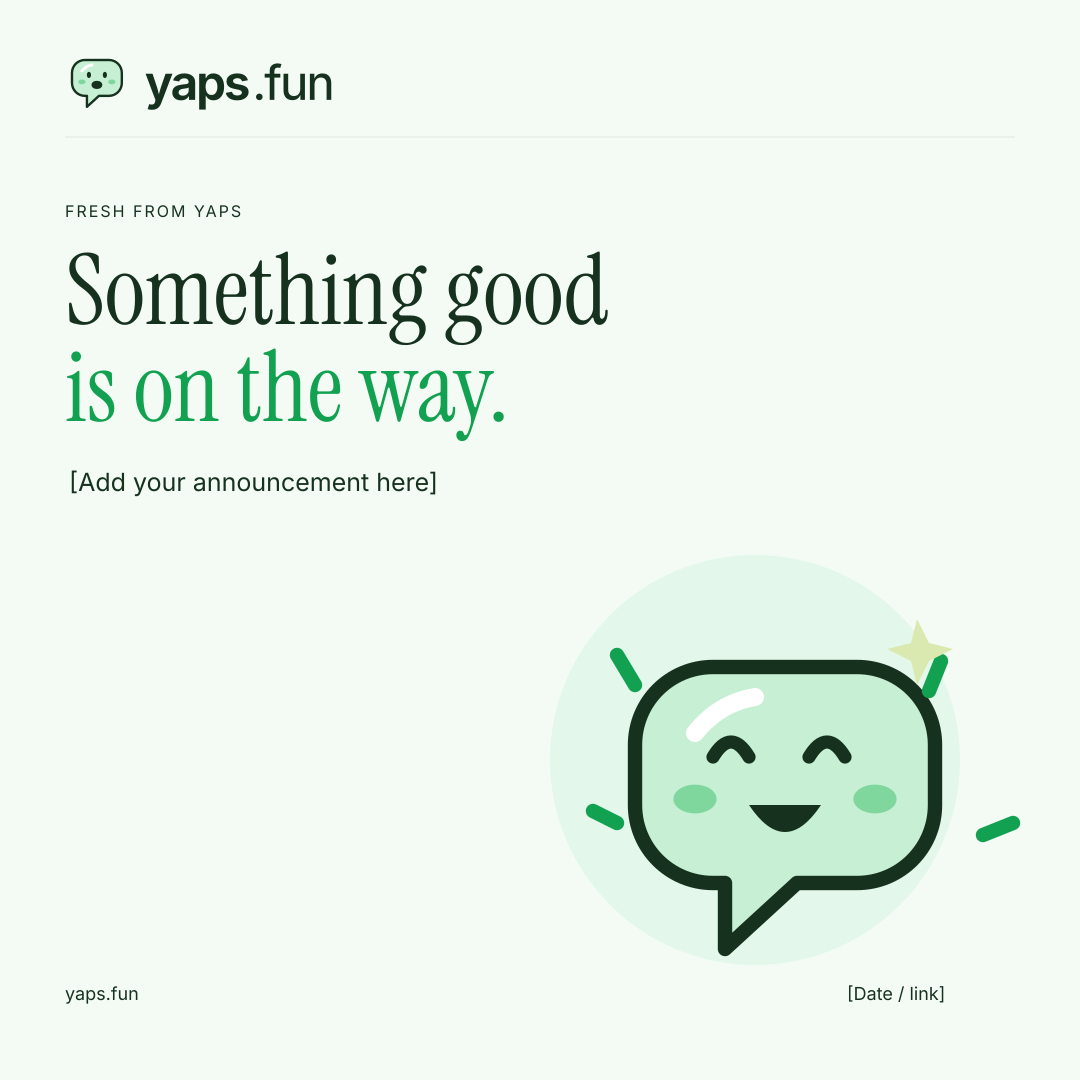
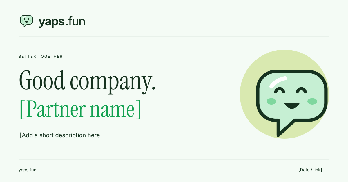
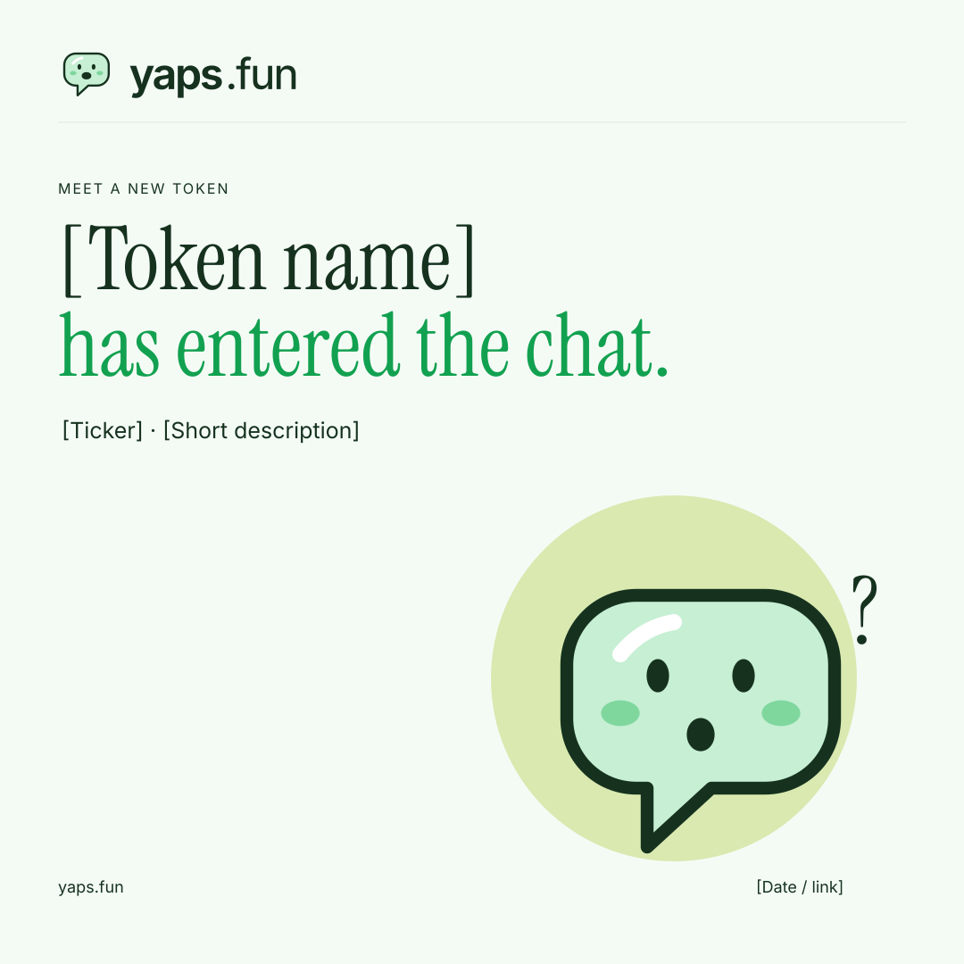
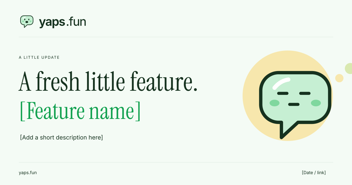
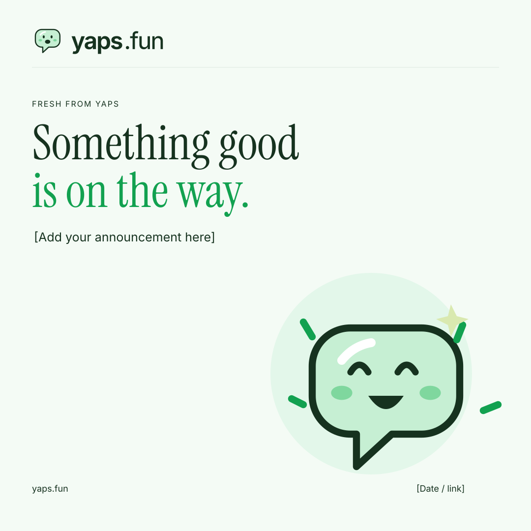
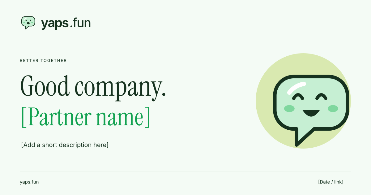
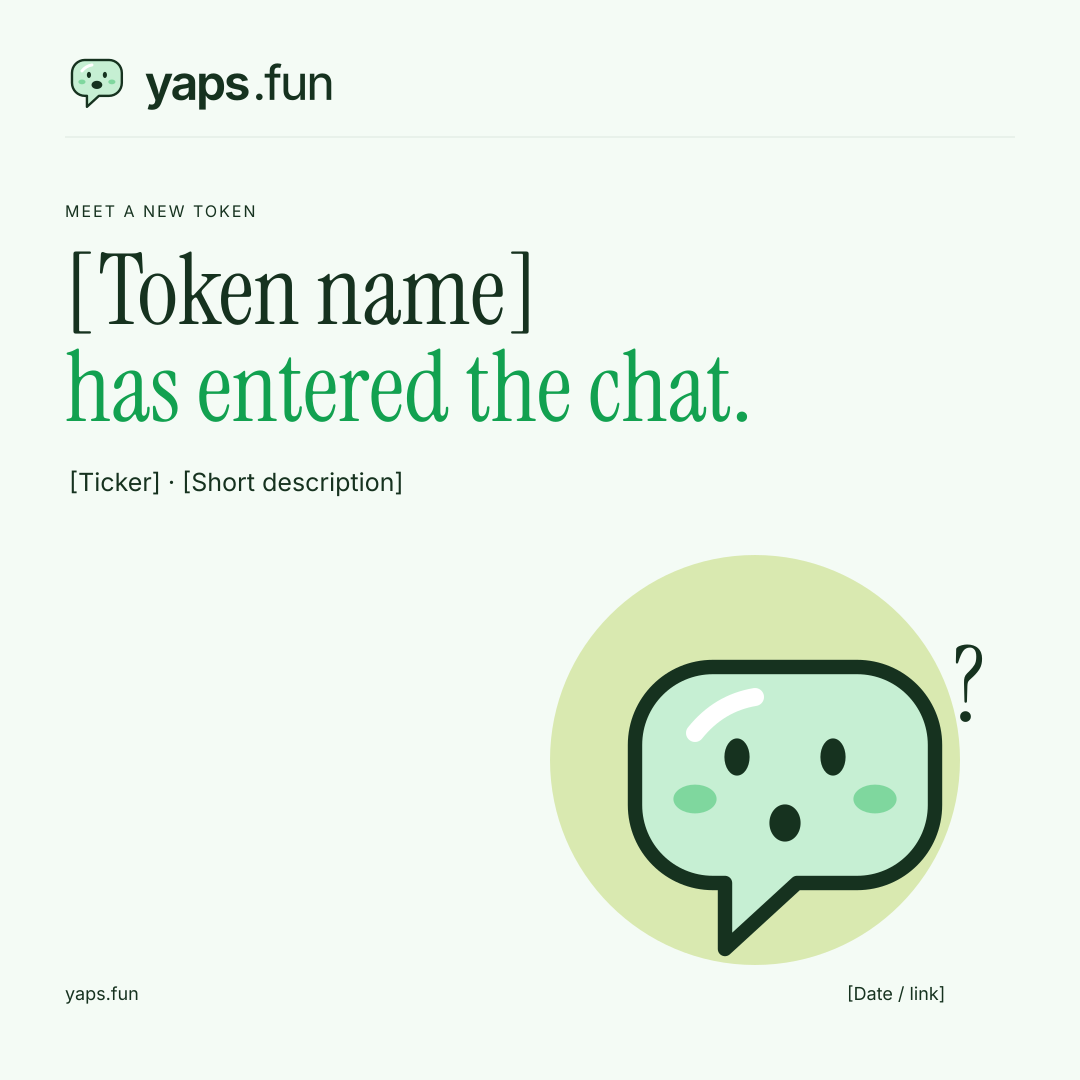
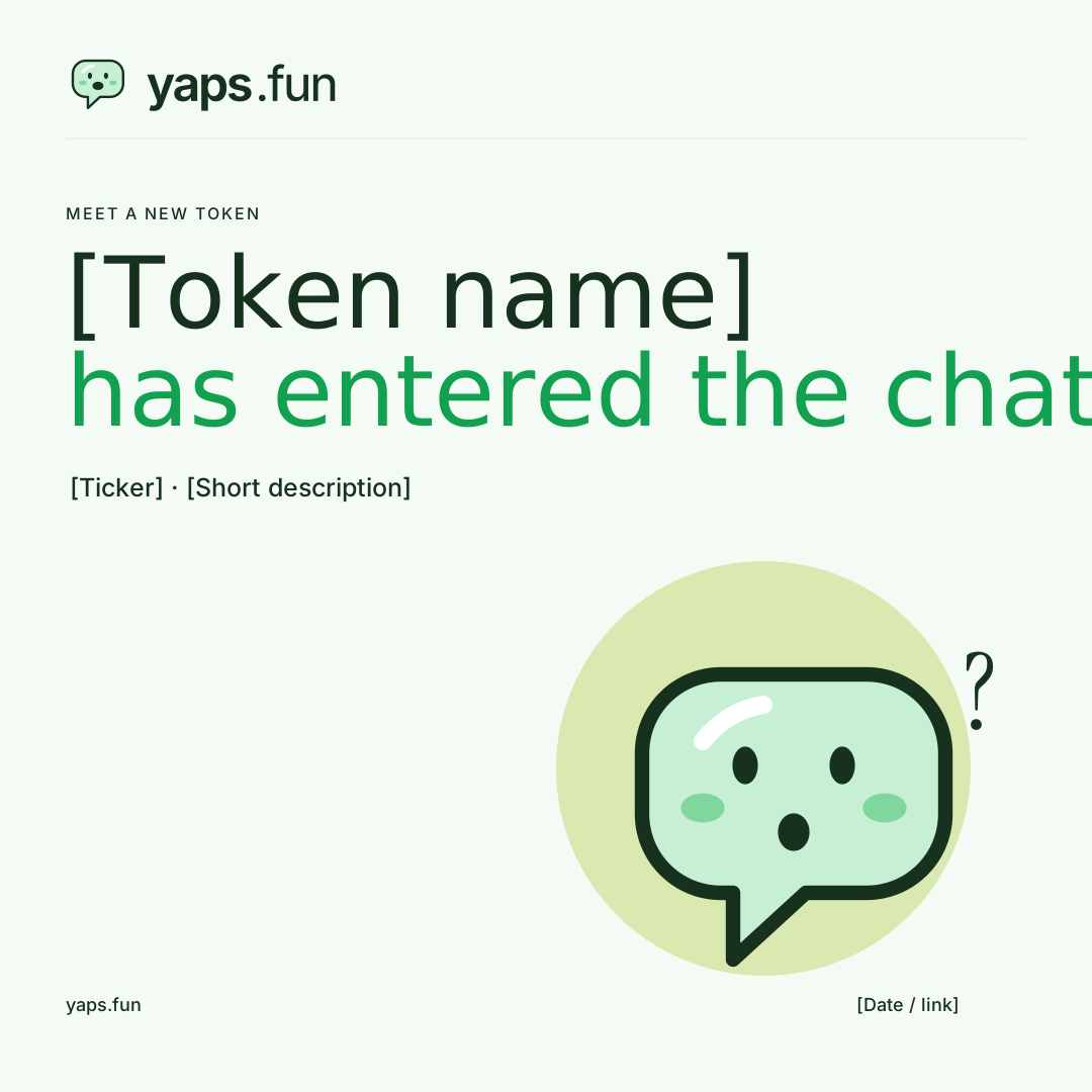
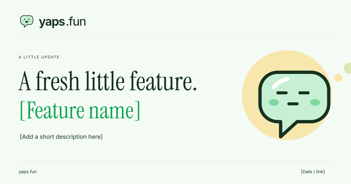
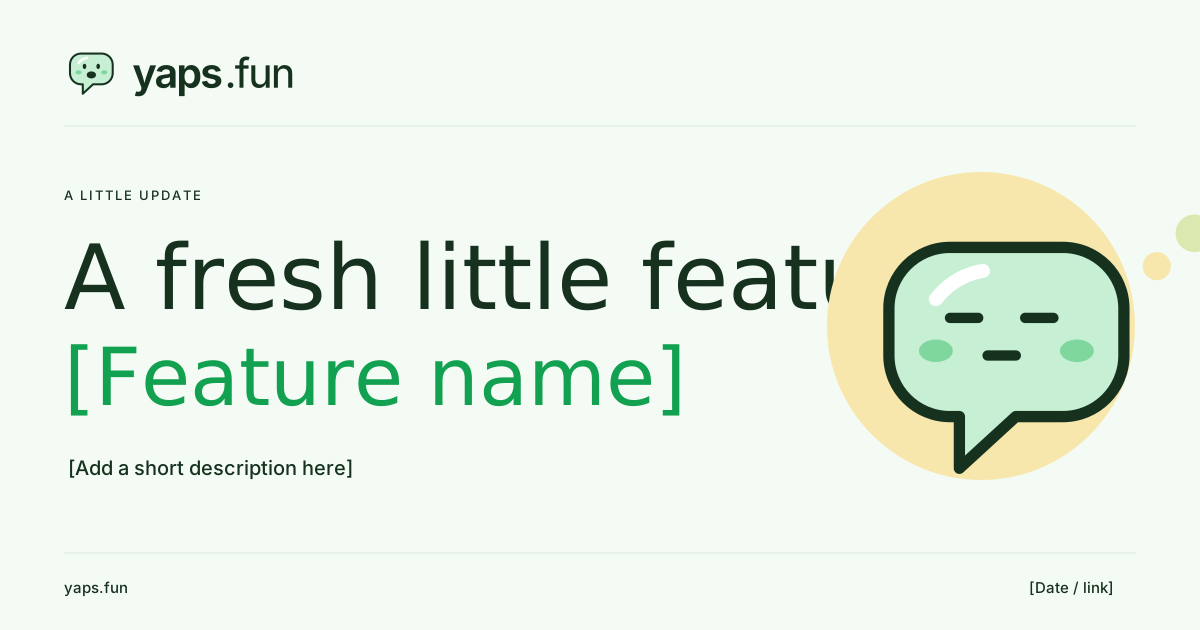
A profile picture, a new announcement, a moment together. Pick a starting point and make the message yours.
Replace the sample copy and partner placeholders before publishing. Keep important details away from edges and check the final crop on your chosen channel.
Keep yaps recognizable wherever it shows up. These small rules help everything feel like it belongs together.

Leave at least one quarter of the mark's square height around the complete logo. Keep text and other graphics outside this space.
Use the full horizontal logo at 160 px wide or larger; use the standalone mark at 24 px or larger. The simplified favicon is the only 16 px exception.
Keep it familiar ✓Don’t stretch it ×Use the supplied vector files. Preserve the lettering, the rounded bubble, and the little talking mouth. Do not retype the name, stretch, rotate, recolor, or add effects to the logo.
Warm, playful, and clear. Make room for humor in community posts; keep amounts, fees, transaction states, and errors precise. Never imply guaranteed returns.
yaps.fun is where a launch's conversation lives: say it, and see who is really talking.
Interface icons use a 24 × 24 grid, 1.75-unit strokes, round caps, and round joins. Keep utility icons clear and separate from decorative mascot illustrations.
Read the full guidelines · PDF ↗Use these assets to identify or discuss yaps.fun. Keep the brand recognizable and do not imply an endorsement or partnership that has not been agreed. Included fonts retain their own licenses.